Python Fundamentals IV: data visualization with Matplotlib
Welcome to this interactive lesson on Matplotlib, Python’s most popular library for creating high-quality figures and visualizations.
1. Introduction and Setup
What is Matplotlib?
Matplotlib (mpl) is a Python library for producing publication-quality figures
It allows exporting figures in various formats: both raster (png, jpg, tif) and vector (pdf, svg, eps)
Provides full control over every element of the plot through an object-oriented interface
The most commonly used functions are in the
pyplotmodule
Let’s get started!
Getting Started: Importing Matplotlib
To use Matplotlib, we need to import the pyplot module. The standard convention is to import it as plt. It is also convenient to import matplotlib itself as mpl for accessing configuration settings. Lastly, we will need Numpy to generate some sample arrays for our plots.
[ ]:
# Import necessary libraries
from matplotlib import pyplot as plt
import matplotlib as mpl
import numpy as np

print("Matplotlib imported successfully!")
Matplotlib imported successfully!
2. Plotting basics
Your First Plot: Plotting Arrays
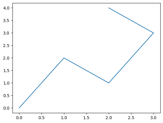
The pyplot.plot() function allows you to represent two arrays (x and y) on a Cartesian plane.
WARNING: the two arrays must have the same number of elements!
Basic workflow:
Initialize a figure with
plt.figure()Plot data with
plt.plot(x, y)Display with
plt.show()(not needed in Jupyter notebooks)
[ ]:
# Create two arrays
x = np.array([0, 1, 2, 3, 2])
y = np.array([0, 2, 1, 3, 4])

plt.figure()  # Initialize figure
plt.plot(x, y)  # Plot the two arrays
plt.show()  # Display the figure
Scatter Plots
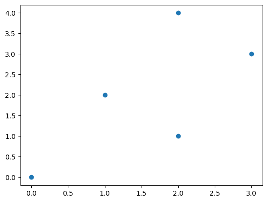
By default, plt.plot() connects points with a line. To plot individual points as dots, use plt.scatter():
[ ]:
# Same data as before
x = np.array([0, 1, 2, 3, 2])
y = np.array([0, 2, 1, 3, 4])

plt.figure()
plt.scatter(x, y)  # Scatterplot
plt.show()
3. Customizing plots
Plotting Functions: Damped Oscillator
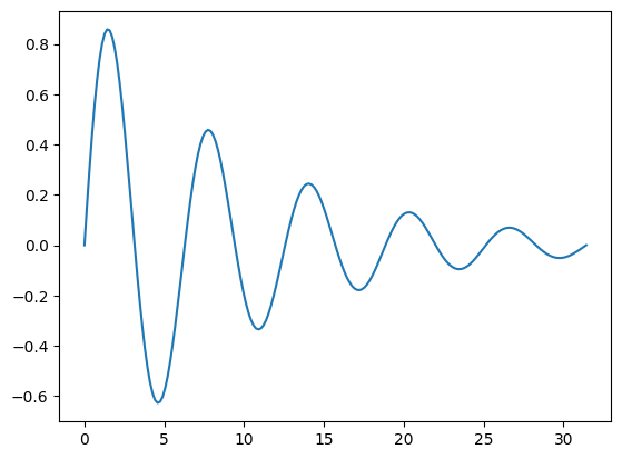
Let’s start with a more realistic example: the response of a damped oscillator with damping coefficient of 0.1, shown as the evolution of the oscillation amplitude \(z\) over time.
The equation is: \(z(t) = e^{-0.1t} \sin(t)\)
We will create a time array t and compute the corresponding amplitude values z(t). Then, we will plot the results using plt.plot() as for the line plot above.
[ ]:
t = np.linspace(0, 10*np.pi, 200) # generate evenly spaced time values from 0 to 10π
z = np.exp(-0.1*t) * np.sin(t)

plt.figure()
plt.plot(t, z)
plt.show()
Adding Axis Labels and Title
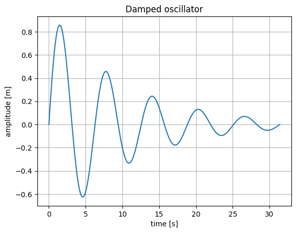
Let’s improve our plot by adding:
A title
Axis labels
A grid
[ ]:
t = np.linspace(0, 10*np.pi, 200)
z = np.exp(-0.1*t) * np.sin(t)

plt.figure()
plt.plot(t, z)
plt.title('Damped oscillator')  # Title
plt.grid('on')  # Grid
plt.xlabel('time [s]')  # X-axis label
plt.ylabel('amplitude [m]')  # Y-axis label
plt.show()
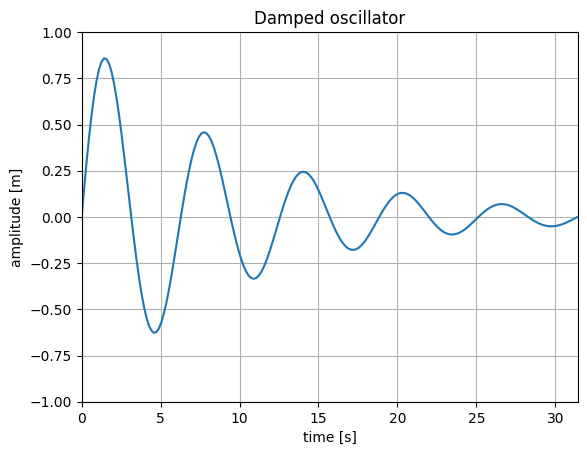
Limiting axis ranges
We can limit the axis ranges using plt.xlim() and plt.ylim().
[ ]:
t = np.linspace(0, 10*np.pi, 200)
z = np.exp(-0.1*t) * np.sin(t)

plt.figure()
plt.plot(t, z)
plt.title('Damped oscillator')  # Title
plt.grid('on')  # Grid
plt.xlabel('time [s]')  # X-axis label
plt.ylabel('amplitude [m]')  # Y-axis label
plt.xlim(0, np.max(t))  # Limit x-axis
plt.ylim(-1, 1)  # Limit y-axis
plt.show()
Controlling Font Sizes
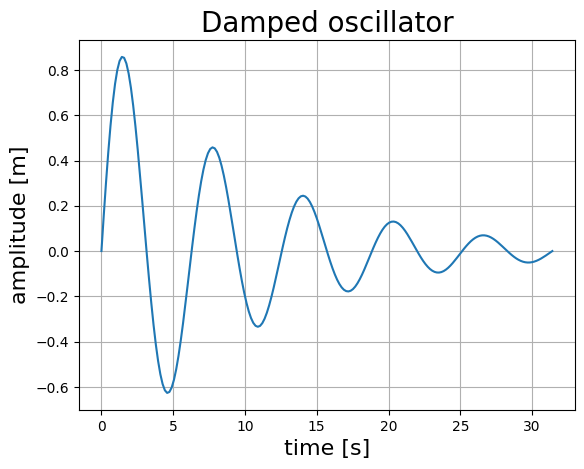
The default font sizes are often not optimal. We can set custom sizes using the fontsize parameter:
[ ]:
t = np.linspace(0, 10*np.pi, 200)
z = np.exp(-0.1*t) * np.sin(t)

plt.figure()
plt.plot(t, z)
plt.title('Damped oscillator', fontsize=20)  # Title (20 pt)
plt.grid('on')
plt.xlabel('time [s]', fontsize=16)  # X-axis label (16 pt)
plt.ylabel('amplitude [m]', fontsize=16)  # Y-axis label (16 pt)
plt.show()
Using LaTeX Math Mode
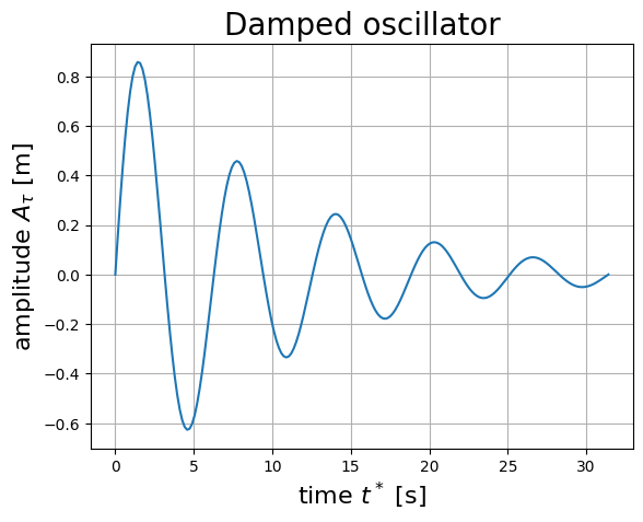
You can use LaTeX syntax for mathematical expressions by adding r before a string and using dollar signs $ for math mode:
[ ]:
t = np.linspace(0, 10*np.pi, 200)
z = np.exp(-0.1*t) * np.sin(t)

plt.figure()
plt.plot(t, z)
plt.title('Damped oscillator', fontsize=20)
plt.grid('on')
plt.xlabel(r'time $t^*$ [s]', fontsize=16)  # Math mode for superscript
plt.ylabel(r'amplitude $A_{\tau}$ [m]', fontsize=16)  # Math mode for subscript
plt.show()
Customizing Line Style, Width, and Color
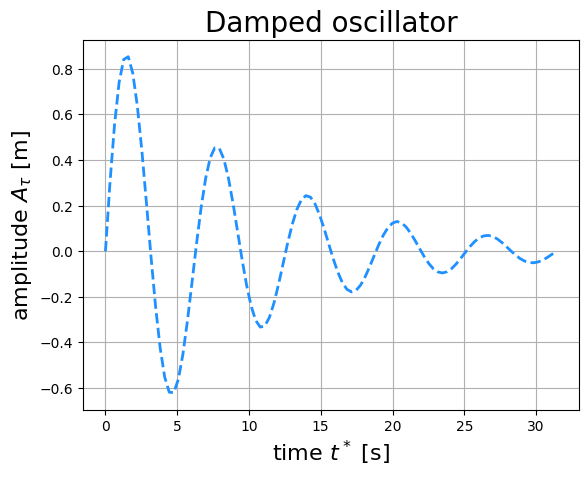
You can customize the “style” of a line by making it for dashed or dotted, for example, or by adjusting its width. Clearly, you can also customize the color of the line.
Line style: add one of the following characters right after the arrays that you are plotting: '-' (solid), '--' (dashed), '-.' (dash-dot), ':' (dotted). Alternatively, you can use the linestyle parameter along with 'solid', 'dashed', 'dashdot', or 'dotted'.
Line width: use the lw parameter (e.g., lw=2)
Line color: use the color parameter, followed by a color specification. Here are some ways to specify colors:
Some colors can be defined using a single letter:
'r'(red),'g'(green),'b'(blue),'k'(black),'c'(cyan),'m'(magenta),'y'(yellow).Alternatively, you can use hex codes directly, like
'#FF5733', or RGB codes, like(0.1, 0.2, 0.5).You can also use full color names, like
'orange','purple', or'coral'. See the image below for a list of named colors:

Let’s apply these customizations to our damped oscillator plot:
[ ]:
t = np.linspace(0, 10*np.pi, 100)
z = np.exp(-0.1*t) * np.sin(t)

plt.figure()
plt.plot(t, z,
         '--',  # Dashed line
         color='dodgerblue', # Line color
         lw=2)  # Line width
plt.title('Damped oscillator', fontsize=20)
plt.grid('on')
plt.xlabel(r'time $t^*$ [s]', fontsize=16)
plt.ylabel(r'amplitude $A_{\tau}$ [m]', fontsize=16)
plt.show()
Customizing Markers in Scatter Plots
Similarly to lines, also scatter plots can be customized in terms of marker style, size, and color.
Marker style: 'o' (circle), 's' (square), '^' (triangle), '*' (star), '+' (plus), 'x' (cross)
Marker size: use the s parameter (e.g., s=100)
Marker color: use the color parameter, analogous to line colors (see above)
Marker edge color and width: use the edgecolors and linewidths parameters
[ ]:
# Create sample data for scatter plot
t = np.linspace(0, 10*np.pi, 100)
z = np.exp(-0.1*t) * np.sin(t)

# Create the scatter plot with customization
plt.figure()
plt.scatter(t, z,
           marker='o',  # Marker style (circle)
           s=100,  # Marker size
           color='coral',  # Marker color
           edgecolors='black',  # Edge color around markers
           linewidths=1.5)  # Edge line width

plt.title('Damped oscillator - Scatter Plot', fontsize=18)
plt.grid('on')
plt.xlabel(r'time $t^*$ [s]', fontsize=16)
plt.ylabel(r'amplitude $A_{\tau}$ [m]', fontsize=16)
plt.show()
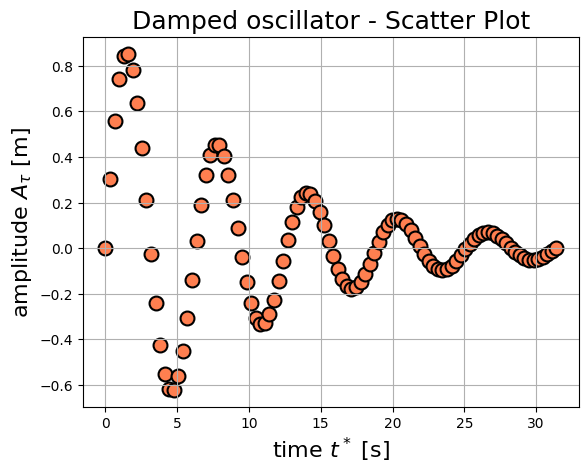
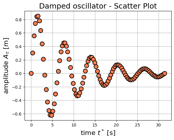
You might have noticed that, with the current settings, the markers appear below the grid lines. To fix this, we can use the zorder parameter to set the drawing order of plot elements. Higher zorder values are drawn on top of lower ones.
[ ]:
# Create sample data for scatter plot
t = np.linspace(0, 10*np.pi, 100)
z = np.exp(-0.1*t) * np.sin(t)

# Create the scatter plot with customization
plt.figure()
plt.scatter(t, z,
           marker='o',  # Marker style (circle)
           s=100,  # Marker size
           color='coral',  # Marker color
           edgecolors='black',  # Edge color around markers
           linewidths=1.5,  # Edge line width
           zorder=2)  # Set z-order to bring markers to front

plt.title('Damped oscillator - Scatter Plot', fontsize=18)
plt.grid('on', zorder=1) # Grid behind markers
plt.xlabel(r'time $t^*$ [s]', fontsize=16)
plt.ylabel(r'amplitude $A_{\tau}$ [m]', fontsize=16)
plt.show()
Combining lines and markers
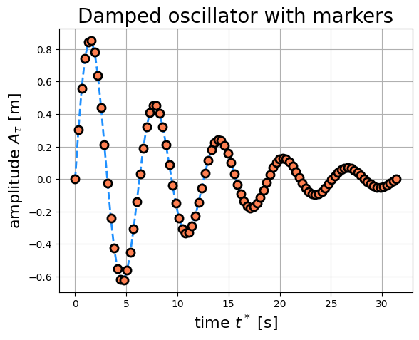
A line can be plotted with markers at each data point using plt.plot(). To do so, add the marker style to the line style, e.g., '--o' for a dashed line with circle markers. You can use the same line customization parameters as above, while the marker properties are controlled by markersize, markerfacecolor, markeredgewidth and markeredgecolor.
[ ]:
t = np.linspace(0, 10*np.pi, 100)
z = np.exp(-0.1*t) * np.sin(t)

plt.figure()
plt.plot(t, z,
         '--o',
         color='dodgerblue',
         lw=2,
         markersize=8,
         markerfacecolor='coral',
         markeredgewidth=2,
         markeredgecolor='black'
         )
plt.title('Damped oscillator with markers', fontsize=20)
plt.grid('on')
plt.xlabel(r'time $t^*$ [s]', fontsize=16)
plt.ylabel(r'amplitude $A_{\tau}$ [m]', fontsize=16)
plt.show()
4. Multiple Curves on the Same Plot
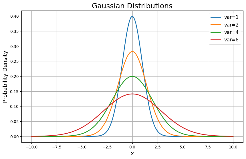
You can plot multiple curves by calling plt.plot() multiple times. Use the label parameter to assign a label to each curve you plot. Then call plt.legend() to create a legend that displays all labels.
[ ]:
# Gaussian distributions with different variances
x = np.linspace(-10, 10, 200)
variances = [1, 2, 4, 8]

plt.figure(figsize=(10, 6)) # Set figure size

for var in variances:
    std = np.sqrt(var)
    pdf = 1/(std * np.sqrt(2*np.pi)) * np.exp(-x**2 / (2*std**2))
    plt.plot(x, pdf, label=f'var={var}', linewidth=2)

plt.legend(loc='best', fontsize=12)
plt.title('Gaussian Distributions', fontsize=18)
plt.xlabel('x', fontsize=14)
plt.ylabel('Probability Density', fontsize=14)
plt.grid('on')
plt.show()
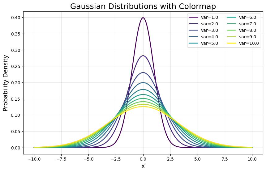
Using Colormaps in line plots
For many curves, using a colormap creates a smooth color sequence. This is especially useful when showing the effect of a changing parameter (in this case, the distribution variance).
[ ]:
# Gaussian distributions with many variances
x = np.linspace(-10, 10, 200)
variances = np.linspace(1, 10, 10)

# Create a color sequence using the viridis colormap
seq = np.linspace(0, 1, variances.size)
colors = plt.cm.viridis(seq)

plt.figure(figsize=(10, 6))

for i, var in enumerate(variances):
    std = np.sqrt(var)
    pdf = 1/(std * np.sqrt(2*np.pi)) * np.exp(-x**2 / (2*std**2))
    plt.plot(x, pdf, color=colors[i], label=f'var={var:.1f}', linewidth=2)

plt.legend(loc='best', fontsize=10, ncol=2)
plt.title('Gaussian Distributions with Colormap', fontsize=18)
plt.xlabel('x', fontsize=14)
plt.ylabel('Probability Density', fontsize=14)
plt.grid('on', alpha=0.3)
plt.show()
Popular Colormaps
Try different colormaps by changing plt.cm.viridis to:
plt.cm.plasma- purple to yellowplt.cm.inferno- black to yellowplt.cm.magma- black to pink/whiteplt.cm.coolwarm- blue to red (diverging)plt.cm.jet- rainbow (avoid for scientific plots!)
Tip: Use sequential colormaps (like viridis) for ordered data, and diverging colormaps (like coolwarm) for data with a meaningful center.
See the official documentation on colormaps in Matplotlib for more options and details.
6. Histograms
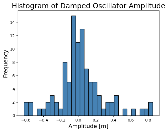
Histograms are a great way to visualize the distribution of values in a dataset. You can create a histogram using the plt.hist() function; here’s an example using the amplitudes of the damped oscillator we plotted earlier:
[ ]:
# Create histogram of the damped oscillator data
plt.figure()
plt.hist(z,
         bins=30,  # Number of bins
         color='steelblue',  # Bar color
         edgecolor='black')  # Edge color of bars

plt.title('Histogram of Damped Oscillator Amplitude', fontsize=18)
plt.xlabel('Amplitude [m]', fontsize=14)
plt.ylabel('Frequency', fontsize=14)
plt.show()
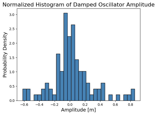
To turn our histogram into a probability density function (PDF), we can set the density parameter to True in the plt.hist() function. This normalizes the histogram so that the area under the histogram sums to 1.
[ ]:
# Create histogram of the damped oscillator data
plt.figure()
plt.hist(z,
         bins=30,  # Number of bins
         density=True,  # Normalize to form a PDF
         color='steelblue',  # Bar color
         edgecolor='black')  # Edge color of bars

plt.title('Normalized Histogram of Damped Oscillator Amplitude', fontsize=16)
plt.xlabel('Amplitude [m]', fontsize=14)
plt.ylabel('Probability Density', fontsize=14)
plt.show()
5. Subplots: Multiple Plots in One Figure
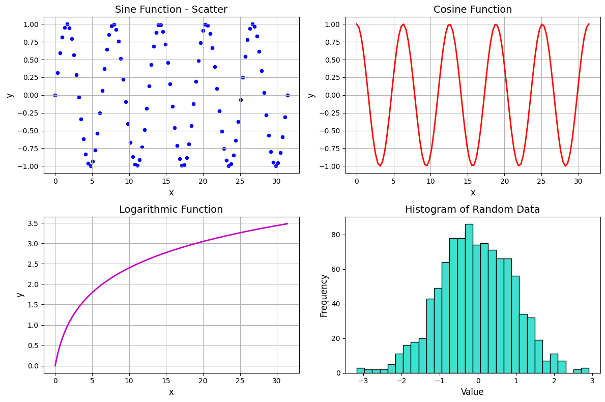
Use plt.subplots() to create a grid of plots. This returns a figure object and an array of axes.
You can plot lines and customize each subplot individually by accessing the axes array using indices, as you would do with matrices.
When working with subplots, the functions for customizing individual subfigures are not the same as the standard plt functions we have covered so far. Here is a comparison table for common customization functions:
Standard |
Subplot |
Description |
|---|---|---|
|
|
Set the plot title |
|
|
Set the x-axis label |
|
|
Set the y-axis label |
|
|
Set the x-axis limits |
|
|
Set the y-axis limits |
|
|
Add a grid to the plot |
|
|
Add a legend to the plot |
For example, instead of plt.title('My Title'), you would use ax.set_title('My Title') when working with a specific subplot axis.
[ ]:
x = np.linspace(0, 10 * np.pi, 100)  # X-axis
# Y-axis data:
y_scatter = np.sin(x)
y_line1 = np.cos(x)
y_line2 = np.log(x + 1)
y_hist = np.random.randn(1000)  # Random data for histogram

# Create a 2x2 grid of axes
fig, ax = plt.subplots(2, 2, figsize=(12, 8))

# Plot on all axes
ax[0, 0].scatter(x, y_scatter, c='blue', s=20)
ax[0, 1].plot(x, y_line1, '-', color='r', lw=2)
ax[1, 0].plot(x, y_line2, '-', color='m', lw=2)
ax[1, 1].hist(y_hist, bins=30, color='turquoise', edgecolor='black')

# Set titles for each subplot
ax[0, 0].set_title('Sine Function - Scatter', fontsize=14)
ax[0, 1].set_title('Cosine Function', fontsize=14)
ax[1, 0].set_title('Logarithmic Function', fontsize=14)
ax[1, 1].set_title('Histogram of Random Data', fontsize=14)

# Set X-axis labels only on bottom row
ax[0, 0].set_xlabel('x', fontsize=12)
ax[0, 1].set_xlabel('x', fontsize=12)
ax[1, 0].set_xlabel('x', fontsize=12)
ax[1, 1].set_xlabel('Value', fontsize=12)

# Set Y-axis labels on all plots
ax[0, 0].set_ylabel('y', fontsize=12)
ax[0, 1].set_ylabel('y', fontsize=12)
ax[1, 0].set_ylabel('y', fontsize=12)
ax[1, 1].set_ylabel('Frequency', fontsize=12)

# Add grid to all subplots except histogram
ax[0, 0].grid('on')
ax[0, 1].grid('on')
ax[1, 0].grid('on')

plt.tight_layout()  # Optimize spacing
plt.show()
7. Saving Figures
Use plt.savefig("name_of_my_file.png") to save your plot to a file. The format is determined by the file extension, which can be one of the following:
Raster formats:
.png,.jpg,.tifVector formats:
.pdf,.svg,.eps(best for publications!)
The dpi parameter controls resolution for raster formats (default is 100, use 300 for high quality).
Setting the bbox_inches parameter to 'tight' trims extra whitespace around the figure, making the saved image equal to that displayed in the notebook.
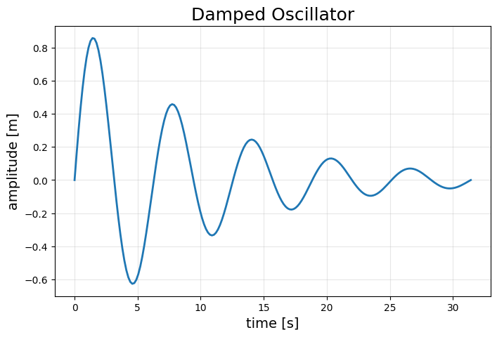
[ ]:
t = np.linspace(0, 10*np.pi, 200)
z = np.exp(-0.1*t) * np.sin(t)

plt.figure(figsize=(8, 5))
plt.plot(t, z, linewidth=2)
plt.title('Damped Oscillator', fontsize=18)
plt.xlabel('time [s]', fontsize=14)
plt.ylabel('amplitude [m]', fontsize=14)
plt.grid('on', alpha=0.3)

# Save as PNG (raster)
plt.savefig('damped_oscillator.png', dpi=300, bbox_inches='tight')

# Save as PDF (vector)
plt.savefig('damped_oscillator.pdf', bbox_inches='tight')

plt.show()

print("Figures saved successfully!")
Figures saved successfully!
8. Changing the Default settings for Plot styles
Instead of specifying things like the font size and line width every time you plot something, you can set default styles at the beginning of your notebook using rcParams.update():
[ ]:
# Set default parameters
mpl.rcParams.update({
    "font.size": 14,
    "legend.fontsize": 12,
    "xtick.labelsize": 11,  # Size of ticks along x-axis
    "ytick.labelsize": 11,  # Size of ticks along y-axis
    "axes.titlesize": 16,
    "axes.labelsize": 13,
    "lines.linewidth": 2,
    "mathtext.fontset": "cm",  # Use Computer Modern font for math (LaTeX style)
})

# Now all plots will use these defaults
t = np.linspace(0, 10*np.pi, 200)
z = np.exp(-0.1*t) * np.sin(t)

plt.figure(figsize=(8, 5))
plt.plot(t, z)
plt.title('Plot with Default Settings')
plt.xlabel('time [s]')
plt.ylabel('amplitude [m]')
plt.grid('on', alpha=0.3)
plt.show()
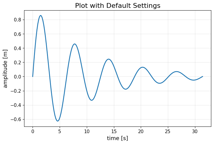
NOTE: Since we changed Matplotlib’s default styles, all subsequent plots will use these new settings. Moreover, re-running the cells above will also produce plots with the updated styles.
To reset them to the original settings you can use:
[ ]:
mpl.rcParams.update(mpl.rcParamsDefault)
9. Wrapping up
You’ve learned the basics of Matplotlib! Here’s what we covered:
Introduction and Setup - Importing Matplotlib and understanding its purpose
Plotting basics - Creating your first plots with
plt.plot()andplt.scatter()Customizing plots - Adding titles, labels, grids, controlling fonts, using LaTeX math, and customizing line styles, colors, and markers
Multiple Curves - Plotting multiple data series on the same plot with legends and colormaps
Subplots - Creating multi-panel figures with
plt.subplots()and understanding the differences betweenpltandaxmethodsHistograms - Visualizing data distributions with
plt.hist()and normalized histogramsSaving figures - Exporting plots in various formats with
plt.savefig()Default settings - Customizing default plot styles using
rcParams.update()
Next Steps
Explore more plot types:
plt.bar(),plt.contour(),plt.imshow(),plt.boxplot()Check out the Matplotlib Gallery for inspiration!
Happy plotting! 📊